Channel Heatmap
Channel Heatmap
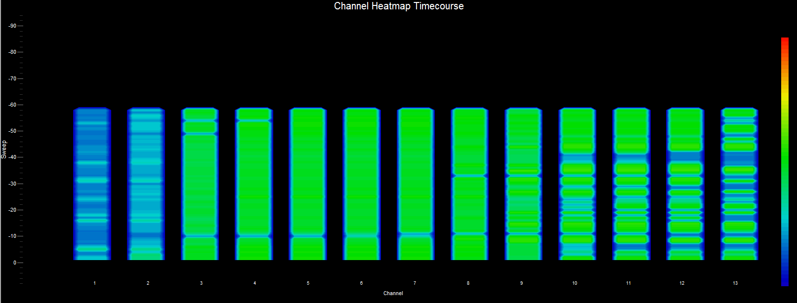
A “channel-centric” chart — similar to the Waterfall History chart above — the difference being that here we plot channels rather than frequencies. That is, along the X-axis we have channels, the Y-axis is a time scale, and the “Z-axis” is the color scale. Each horizontal line in this chart displays the accumulated signal strength (as a color) of all the frequencies that are included within the channel band as measured over the time period of one scan. That is, with each scan (or sweep) a new row is added at the bottom of the chart for each channel. The color legend to the right shows that stronger signals will appear red and weaker signals will appear blue. For “channel-centric” charts, the signal strengths of all frequencies used by a particular channel are summed, normalized and reported as one value.