Channel Density
Channel Density
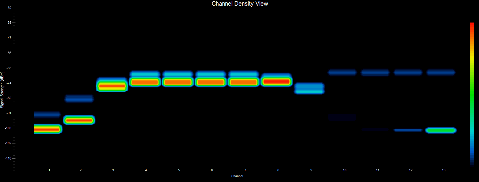
A “channel-centric” chart — similar to the Topographic chart above — the difference being that here we plot channels rather than frequencies. A signal strength that appears with a relatively low occurrence is ‘blueish’ in color, whereas increasingly brighter colors are used for signal strengths that occur more frequently. Signal strengths that occur most often are ‘reddish’ in color. Another way of stating this would be to say this chart uses color to mark the rate of occurrence (i.e. how often) a particular signal strength occurs. For “channel-centric” charts, the signal strengths of all frequencies used by a particular channel are summed, normalized and reported as one value.