Channel Heatmap
Channel Heatmap
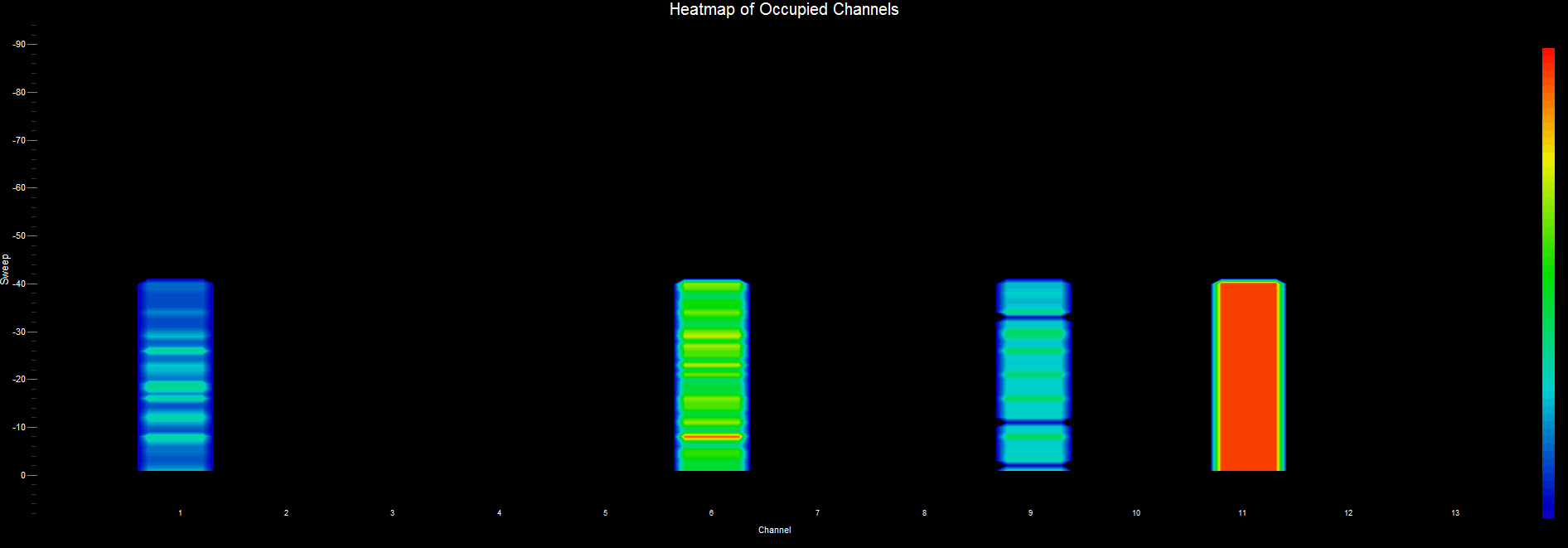
Combines the access points by channel and displays a summary of channel usage as a Heatmap. The Heatmap chart is also known as a “waterfall” graph. It is a 3-dimensional representation of the data, where the X-axis is the channel, the Y-axis is a time scale, and the “Z-axis” is the beacon signal quality that uses a color scale. Each horizontal line in the Heatmap chart displays beacon signal strength (as a color) as a function of channel as measured over the time period of one scan. That is, with each scan (or sweep) a new row is added at the bottom of the Heatmap chart. The color legend to the right shows that stronger signals will appear red and weaker signals will appear blue.