Channel Spectrogram
Channel Spectrogram
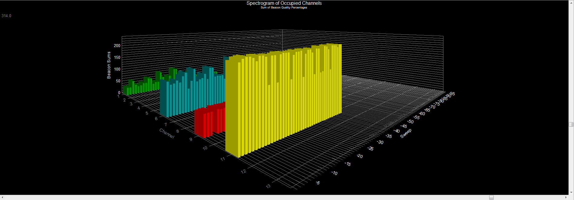
A three-dimensional view of channel usage as a function of time. Each channel is represented by its own set of bar graphs — the X-axis is the channel, the Z-axis is a time scale, and the Y-axis reports the signal strength of beacons as a signal quality (0 – 100%). In this view the data for each channel represents a collection of access points — hence the signal quality as displayed along the Y-axis is often greater than 100%. This is because we are summing the signal qualities for each of the access points that use a particular channel. One thing important to keep in mind is that signal strength is not a reflection of performance — rather, it is an indication of how close an AP is located to the point of measurement.