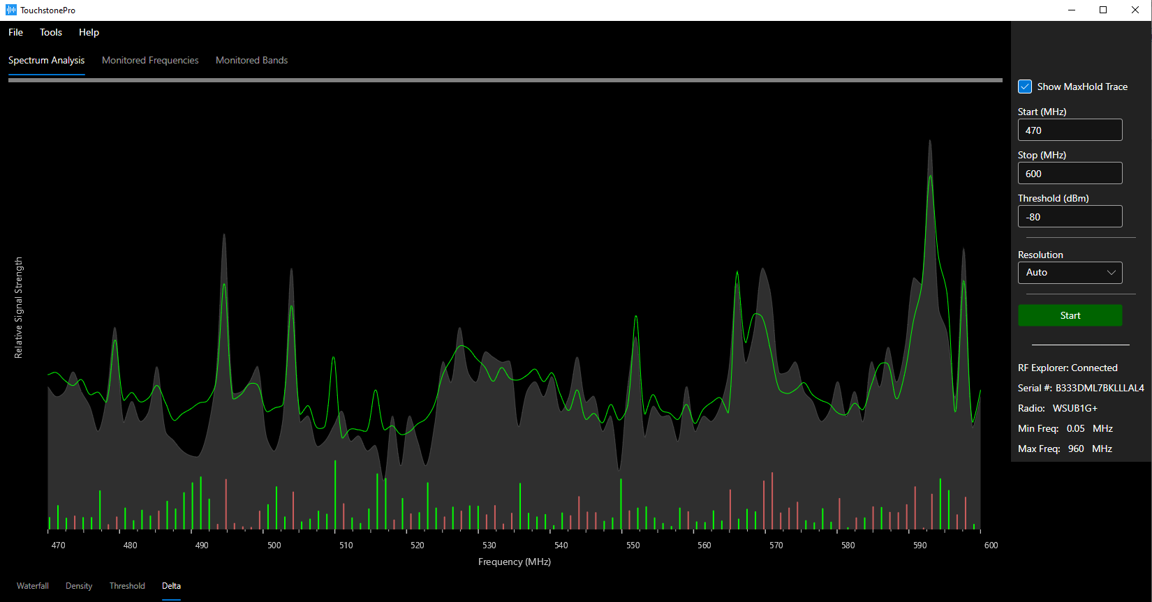
Delta Trace
Used to view small (or large) changes in the RF spectrum over time. Plotting the data in this way makes it easy to detect RF changes that occurred since the initial 'snapshot'.
When scanning begins, the first trace is saved as a snapshot and appears as the stationary, background gray trace. For all subsequent scans, the snapshot trace is subtracted from the current trace and the difference, i.e. ‘delta’, is displayed as red and green bars -- a red bar means the current signal strength at that frequency is less than the snapshot, and a green bar means the current signal strength at that frequency is greater than the snapshot. Plotting the data in this way makes it easy to detect RF changes in transmitted signals that occurred since the initial snapshot and is most useful in environments where RF transmissions change over time.